apomap is a Software for pharmacies, which helps them to manage their delivery service. Core function of the software is its smart route planning and order managment.
When I get involved in the project the whole software was a high functional prototype but didn’t had an great user experience. An overhaul will help to ensure that apomap can rain competitive the long run.
We created a unifying design that merges usability guidelines. I overviewed the whole UX process with the help of the customer support team of apomap. I worked on all aspects of the design system while my developer colleagues parallel implemented the new functions and design.
Insights
The concept
The watchful mark of pharmacies is facing the challenge of digital transformation. Their daily routine consists of complex inventory management systems, paperwork and on-site customer service.
The startup apomap has set itself the task of revolutionizing the messenger service of pharmacies. Research has shown that many delivery services are still determined by excel lists and analog work. This is where apomap comes in, with a focus on intelligent route optimization, simplified management of deliveries, ease of use in day-to-day business, as well as the bond with the end customer.
The apomap universe consists of the all-encompassing desktop software, an app for delivery drivers and a website for end customers.
Core advantages for pharmacies
- connection of pharmacies locations
- Simple logistics
- Simple operation
- Direct interfaces & intelligent CSV import
- Customer loyalty
The user
Pharmacist
The daily work of pharmacists is a mix of consulting customers, managing the goods and taking care of deliveries. with apomap we make sure, that the pharmacist always has an overview of the deliveries and the drivers.
Driver
The delivery drivers are mostly older people who want to earn some extra money on top of their pension or students.
The main focus is on an easy usability of the app. The main functions are, for example, starting a tour, as well as the overview of the tour and its deliveries.
Sitemap
A sitemap is a blueprint – it helps to structure the content and possible functions.
Desktop app for the pharmacist
Onboarding
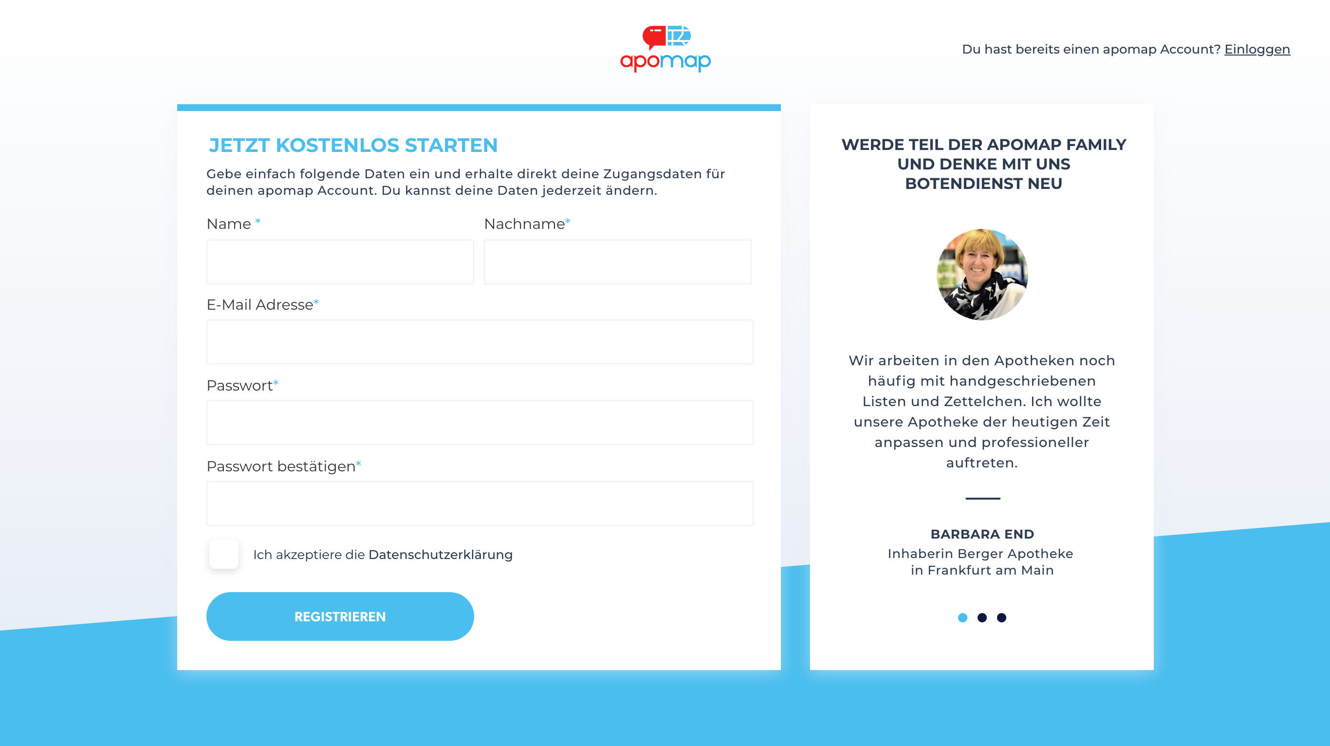
Onboarding asks for data such as the pharmacy’s location and a driver, so the data is saved for first use and helps get started right away.
Dashboard
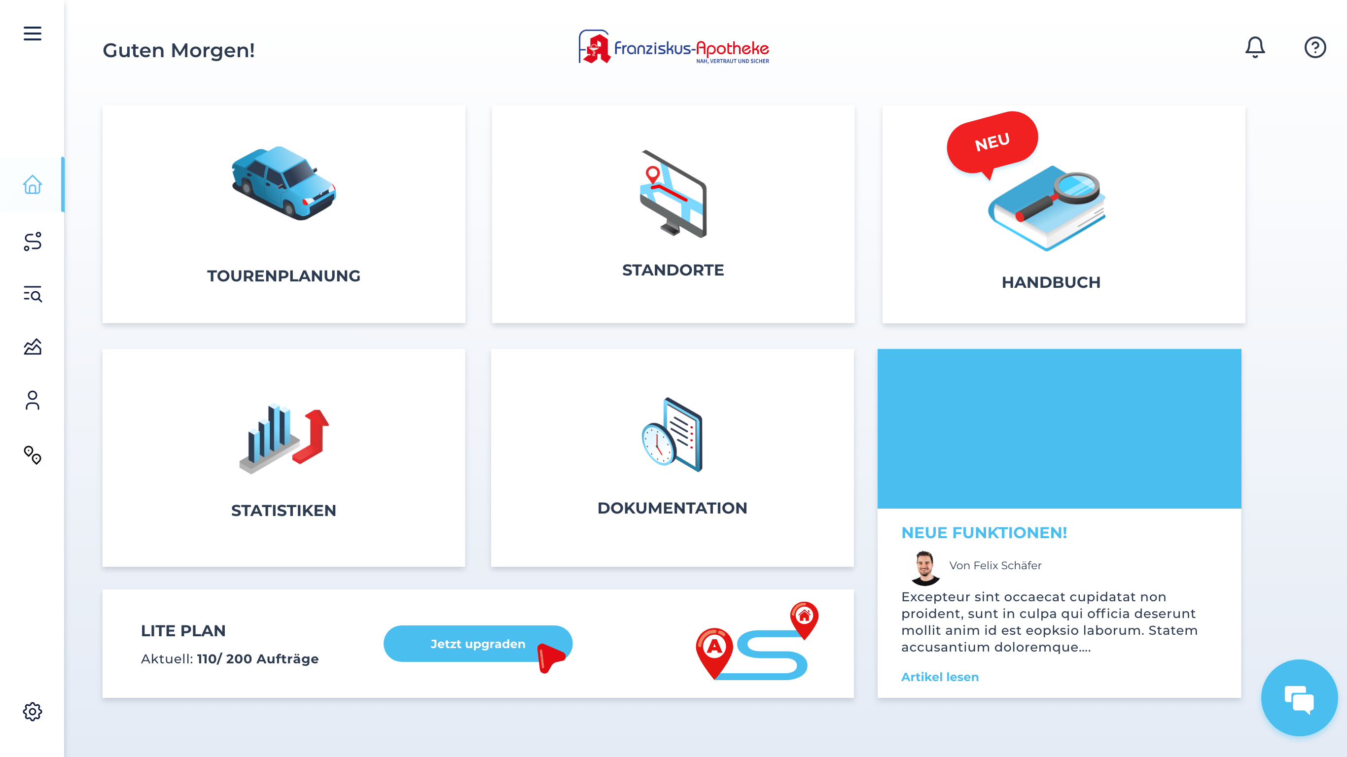
The dashboard shows an overview of all functions that apomap offers. The main focus is on a structured and easy-to-understand interface that is quick to use in the stressful daily routine of pharmacists.
Main Screen
Order management and documentation
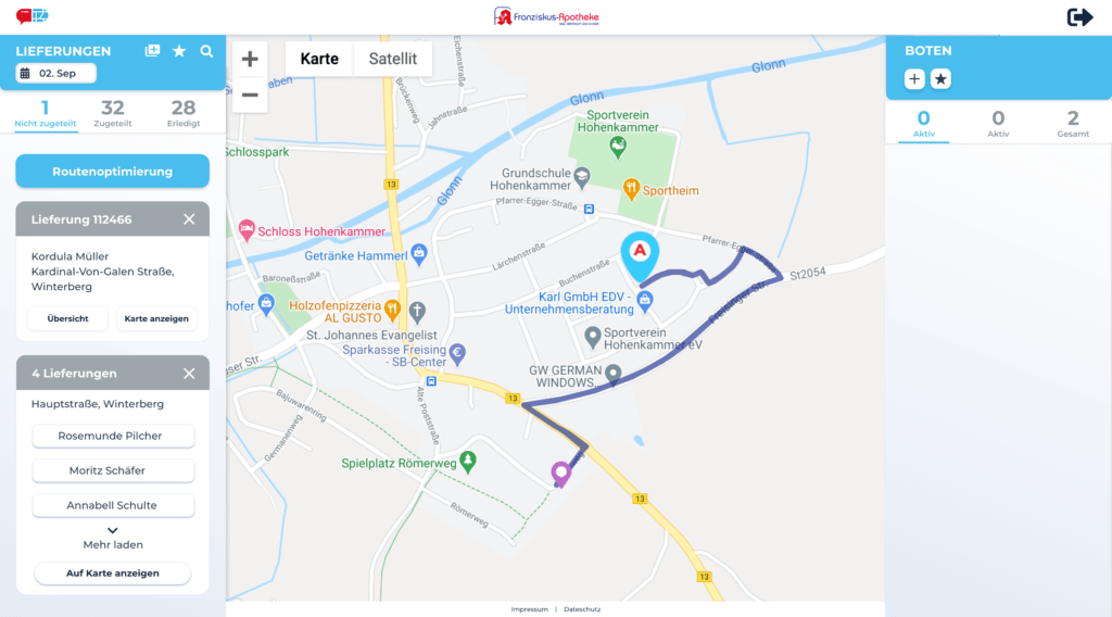
All orders are in one central place. In apomap pharmacist can find all delivery and pickup orders and their status from each location.
The view is either on the deliveries (slider 1) or on the tours (Slide 2). This enables a flexible working environment for the pharmacist.
Planning a tour
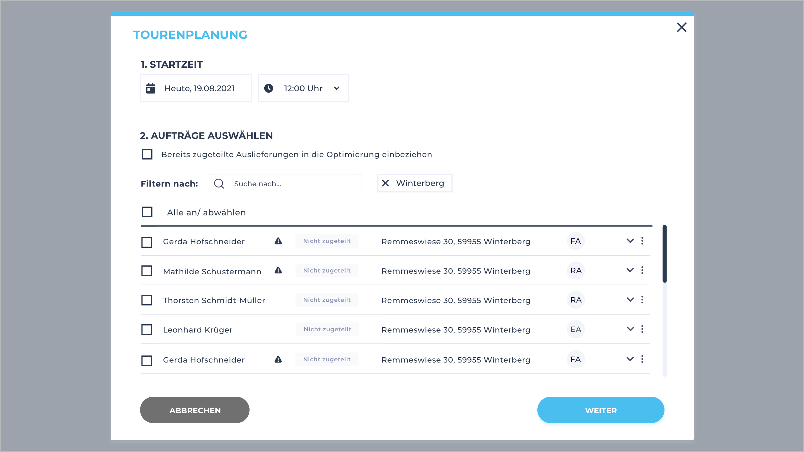
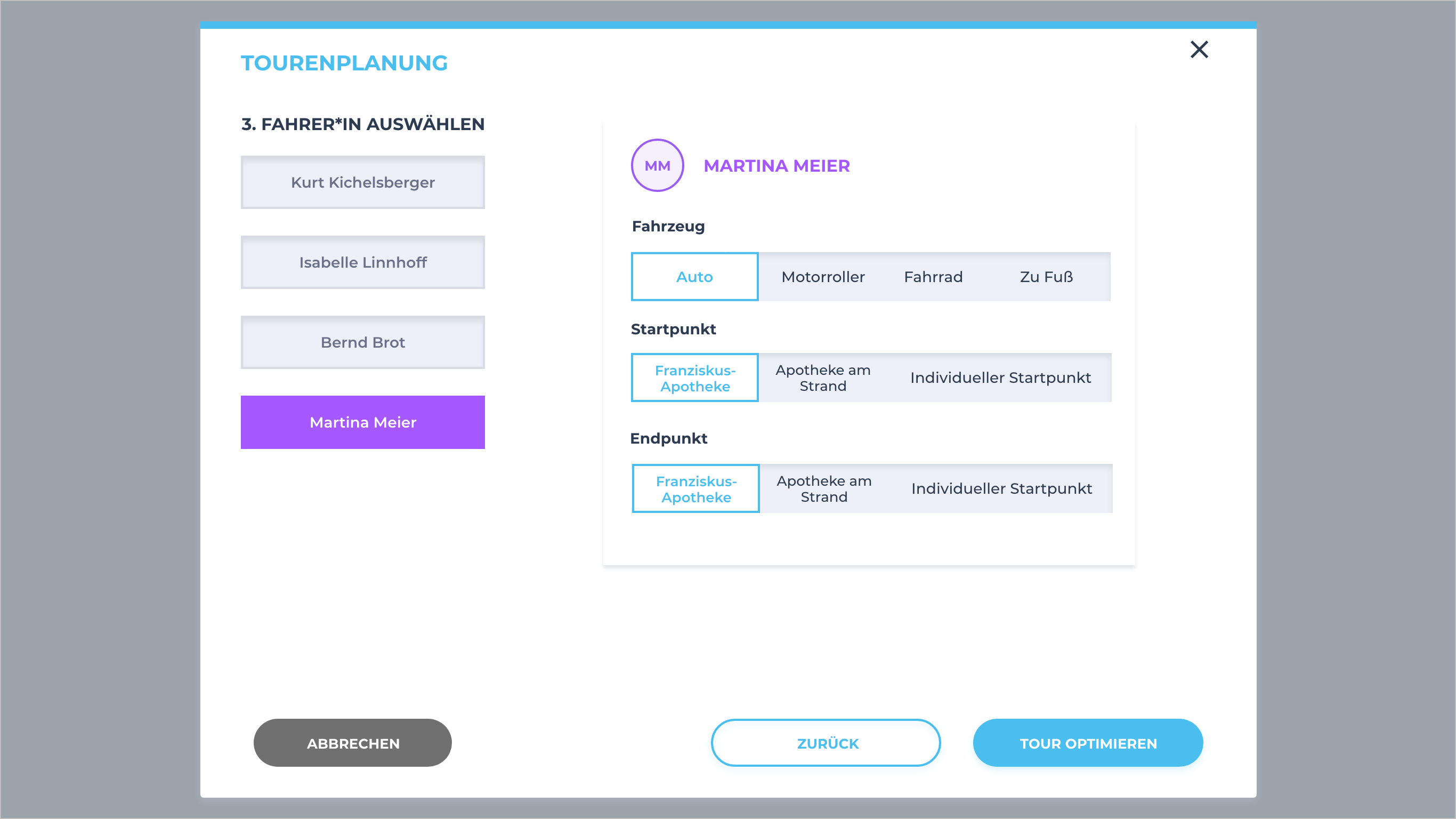
The tour planning is displayed in a pop up, which asks for all relevant information step by step.
First the start time is requested, then the deliveries are selected.
This can be filtered, for example, by all the data that are stored in the delivery, such as city or street name.
Finally, the driver options are selected: Vehicle type, starting point and end point of the tour.
Mobile app for the drivers
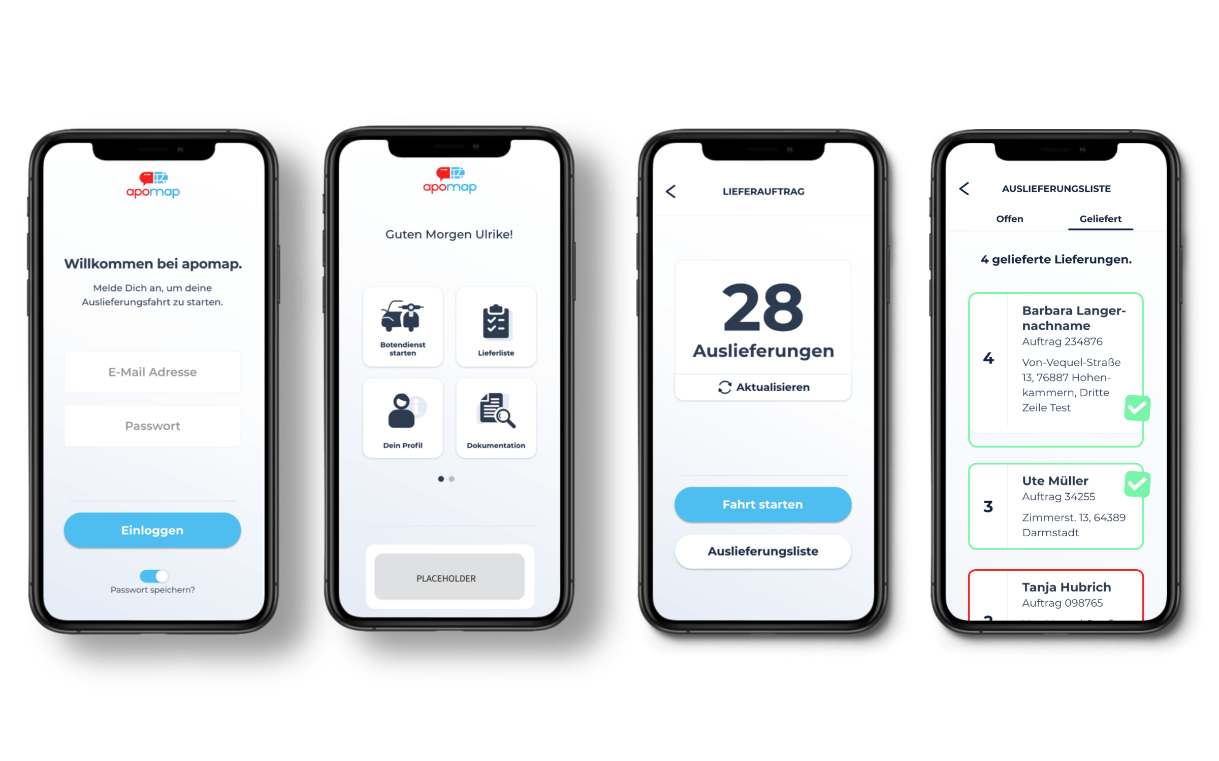
The mobile app for pharmacy drivers is kept very simple and is based on the simplest operations.
The user can start his delivery, has insight into the delivery list and a documentation of his trip.
The design of these screens is not yet adapted to the main system. (end of 2020)
Website for customers
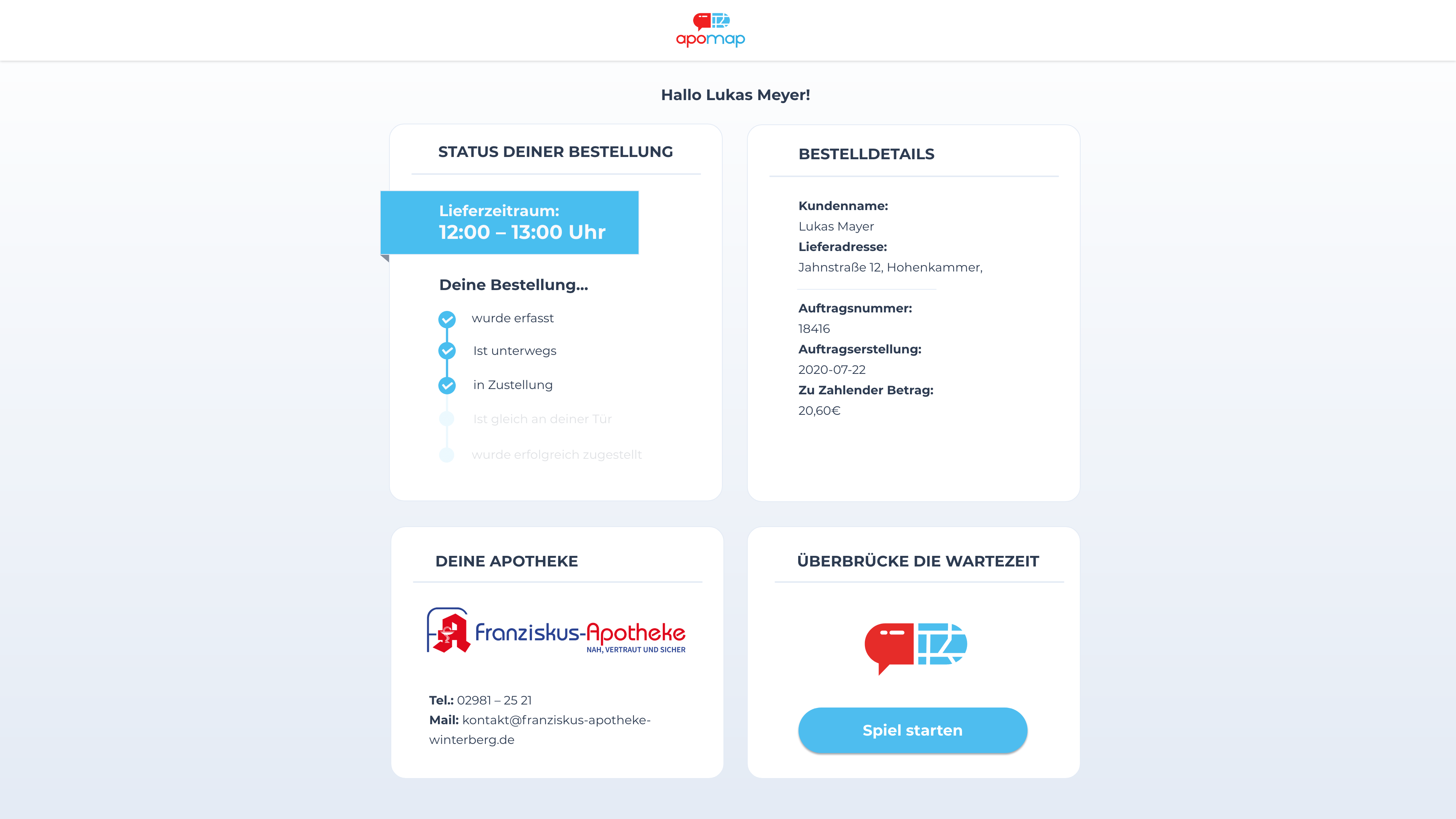
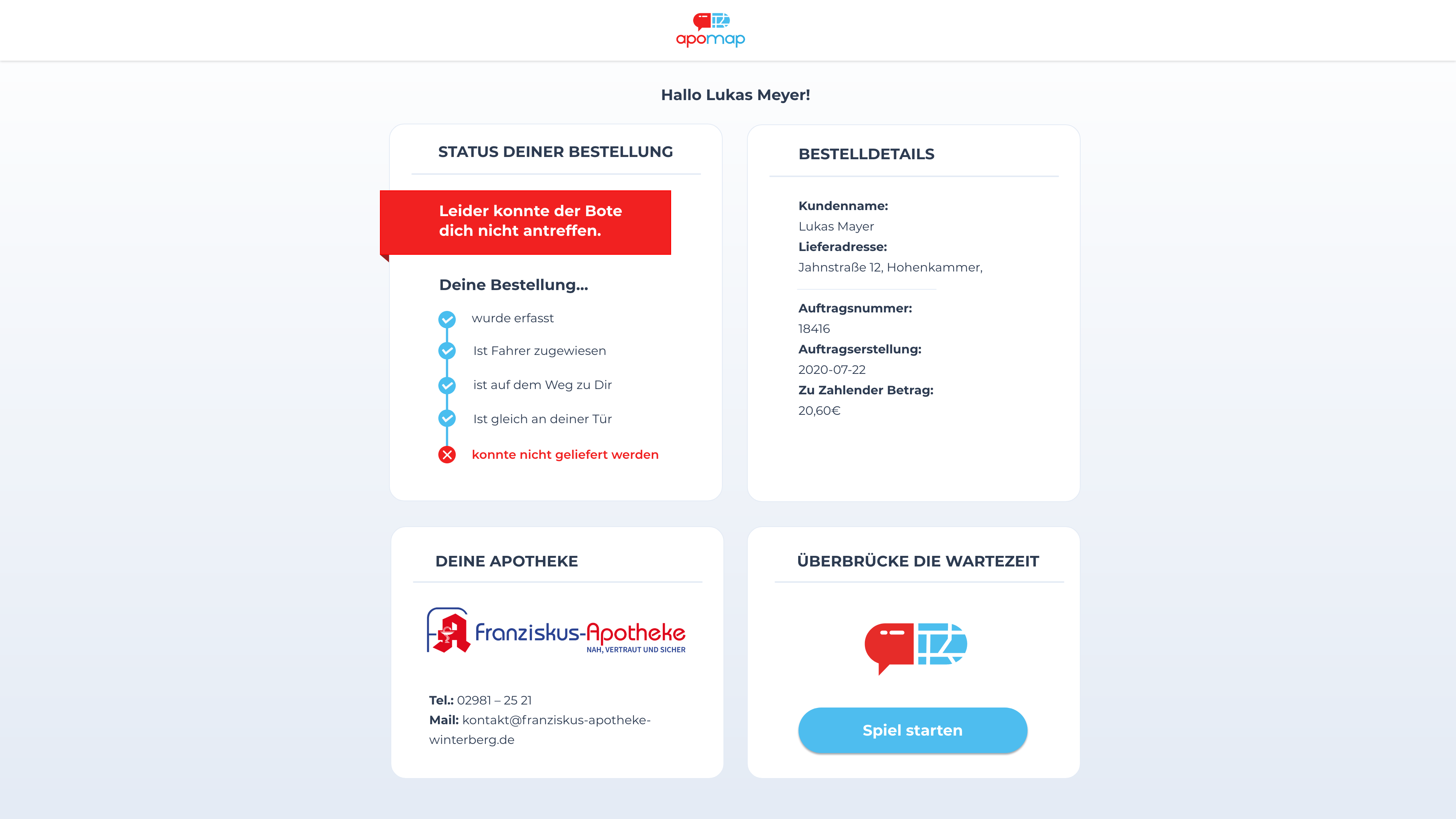
The website shows the current status of the delivery. It strengthens the bond between the pharmacy and the customer.
UI Design
When I started working at Dive Inn, there was already a design language for the brand. It is very clear and futuristic and definitely eye-catching compared to the competitors.
But the UI of the desktop app was a typical prototype design – functional but not that user friendly. After a long run on testing with pharmacies it was time for the next step.
The new user interface design consists of a better design language and focuses more on usability and information architecture.
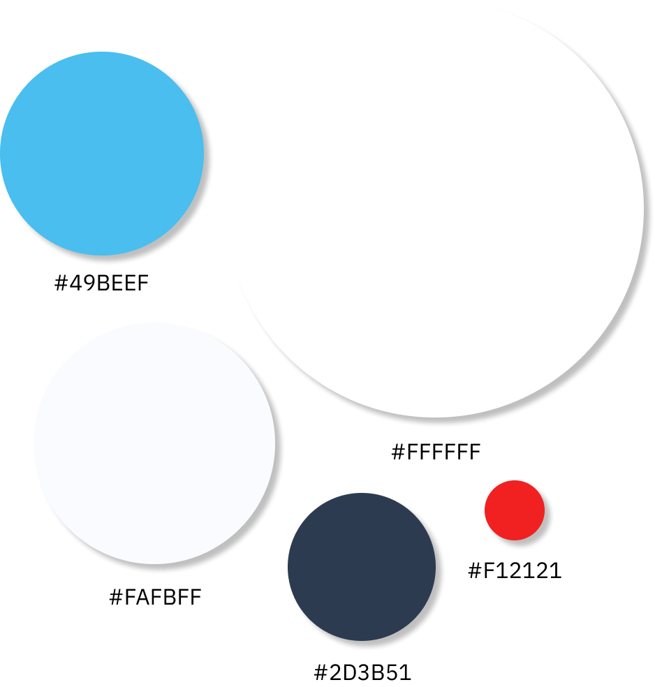
Colors
Typography
Icons
Lined Icons for the navigation and filled to illustrate important interactions.
Buttons
Focus users on the most important required action.
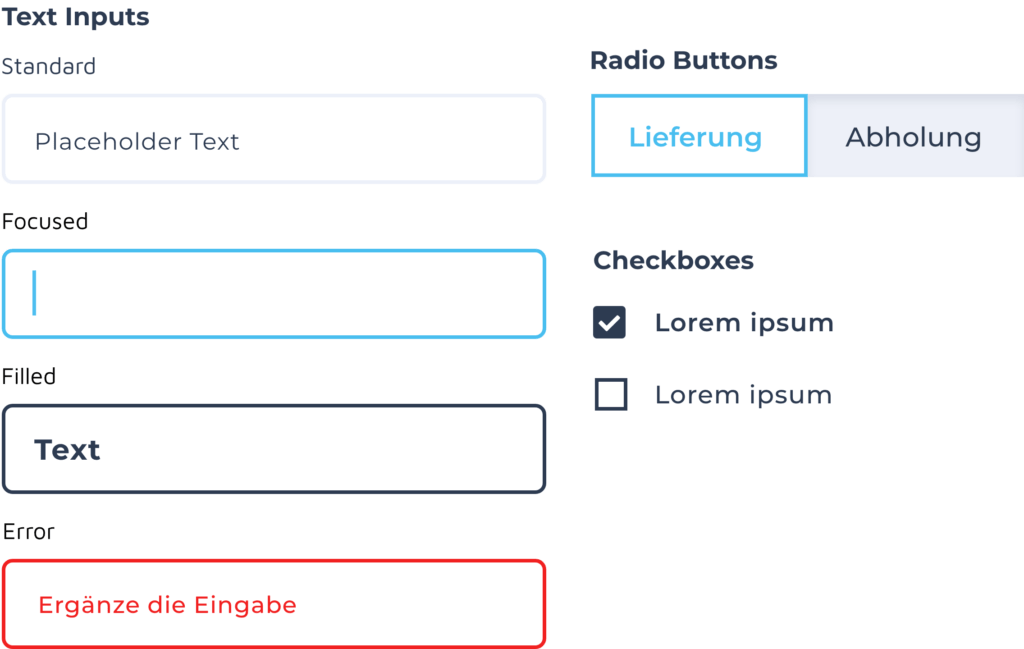
Inputs
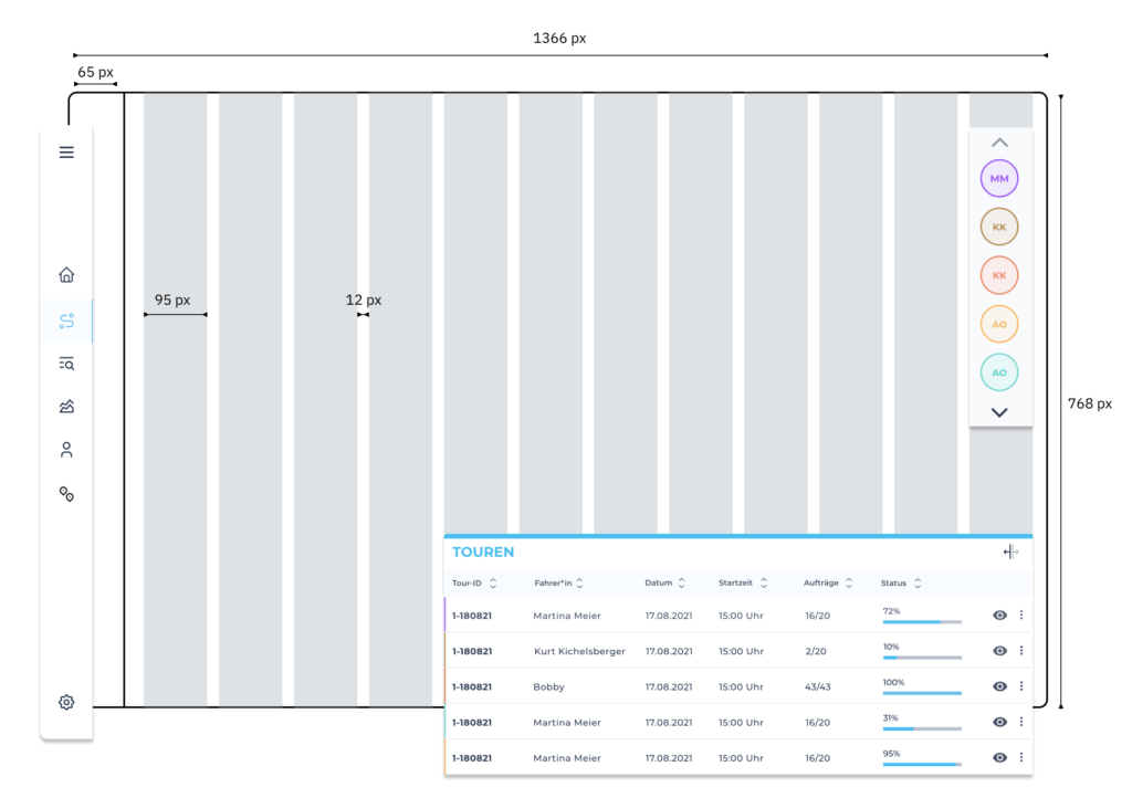
The Grid
I am text block. Click edit button to change this text. Lorem ipsum dolor sit amet, consectetur adipiscing elit. Ut elit tellus, luctus nec ullamcorper mattis, pulvinar dapibus leo.
Driver
Pharmacists can select the color for their drivers – they will be displayed every time the driver is shown.
Epilog
apomap was my first software project, and it was a challenge for me to get to know the users and their daily work.
Since the team was small and it was a start-up, it was important to work in iterations – this was possible by working in design sprints where we could adapt insights into wireframing into designs.
Also, you have to decide on the most important features so you don’t focus on unnecessary features that might be nice to have but aren’t important at the moment. (This was sometimes hard as there were a lot ideas)
Being in constant contact with the development team about features that are possible or not was a good experience.
I also learned how important it is to have a functional design system – I realized that too late. That’s why, for example, the driver app looks a little different than the pharmacy management app.
But I’m glad about what I learned, that’s why I did the memorisely design system bootcamp and I couldn’t be happier with this new knowledge.


